5 ways to quickly improve your video game’s UI

Evaluz Luna
Posted
Crafting an intuitive and engaging user interface (UI) is a crucial step in game development that can significantly enhance the player's experience.
Alongside game mechanics and difficulty progression, UI Design is one of the pillars of successful human-machine interaction. In bigger teams, there are roles that specialise on UI only but… how can solo developers make a UI that’s functional without having to go to design school for 4 years to learn all the scientific based evidence for interface design?
In this article we will give 5 rules of thumb to step up a video game’s User Interface!
Start by testing the UI as an image only
Before getting into the 5 points, we’d like to share the secret - not so secret - for great UI interfaces: Testing-with-users.
Implementing a first prototype with graphics can take time and recruiting quality users isn’t always easy. So, a quick and low effort way to test the UI, is by making a high-fidelity image of the finished UI and asking testers to respond to some questions based on the images.
Testing UI comprehension with images that look as shiny and polished as the final UI, will help the development teams spot UI miscomprehension before they get implemented in the game. Here’s a quick guide on how to do so:
Gather at least 5 people and ask them to describe:
- What are the UI components that they see on the image
UI components might look clear to you, but some users have a hard time guessing what are the indicators that they have on screen. Especially if there is no label or icon to identify what these components mean. - How do they think they can interact with the components
Ask them to demonstrate how they would complete a certain task. For example “how would you activate the power up on this screen?”. Their responses will give a list of things to fix on the UI’s design so they’re no longer confused by the components.
Whenever possible, have a conversation and ask follow up questions to better understand the user’s context by being genuinely interested in why they think a certain way. Each follow up question will be dictated by the kind of information that needs to be collected. Some examples of follow up questions are:
- What do you think that component does?
- What about the component’s design makes you think that?
- I saw you’ve clicked on X button while searching for Y. Why so?
- What were you expecting to find on the next screen by clicking on X button?
Pay special attention if testers get confused or hesitate on certain actions and explanations. They might say “The UI is pretty and clear”, but might struggle to describe what a component does, or take more time than needed to complete a task. Follow up questions are the best way to gather information to inform the future changes on the design of your UI.
Once the user testing notes have been collected, the UI components are ready to be improved. Here are 5 ways that you can tackle a good amount of issues related to UI usability.
Note: There is no advice on visual design (aka “making it pretty”). We will save that information for another article. :)
1: Make each UI component distinguishable
When dealing with UI, users should be able to predict what a component does before interacting with it. For example, a standard field input (1) belongs to the same “family” as a drop down (2), but there are visual cues that tell us that one can be filled with text, while the other is a list from which we can choose from.

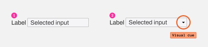
This rule applies for the whole UI kit of the game: components should look coherent and have a visual identifier if they behave differently.
On conservative (and accessible) UI the visual cues remain visible before interacting with them. On the other hand, if you’re going for a minimal and disruptive UI, make sure that you still integrate easy to discover visual clues on how to interact with the components.
2: Use visual cues to make interactions discoverable
Receiving feedback from the system (in this case a video game’s menu) is a very important rule on human-machine interaction. So much so that in the 90’s some UX gurus wrote down the 10 Usability Heuristics for human-machine interactions to craft UI interfaces. It is not a coincidence that “Visibility of System Status” was listed as the first one:
“The design should always keep users informed about what is going on, through appropriate feedback within a reasonable amount of time.”
Sound cues are also appreciated of course, but visuals are more prominent since users might turn the sound off for whatever reason.
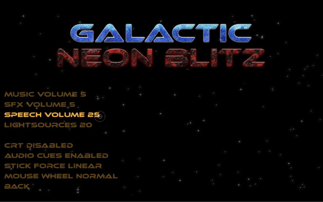
In this example we see a Settings menu from Galactic Neon Blitz prototype by Tulenväki Productions.
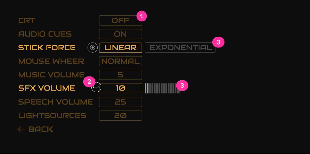
For this version of the prototype, each component gets highlighted when you hover it (visual feedback: check!), however there is no design indicator on the component that tells you how to interact with them.

The way the developers implemented these components is: the user has to click and drag -horizontally or vertically- or use the mouse scroll to change the line value. This will make the number go up or down.
However, there is a problem: it is not clear if the components at the bottom of the screen also respond to the same interaction mechanic… possibly due to the lack of numeric value, or visual indicator that communicates so.
I’d like to call the attention to the fact that the developers made a wise choice on introducing the click and drag dynamic with the first components of the list. This way, the user is more inclined to try the same interaction with the upcoming elements on the list -which work with a single click-.
Here are some design concepts on how the components on the menu could be improved:
- The editable value can be highlighted a certain way to tell the user that the value is open for customisation (1).
- The cursor design can change depending on the component to help the user understand the interaction (2).
- A third indicator could indicate that other values are available (3).
- Suggestion: Adding an arrow on the back button to make it distinguishable from the rest of the list since it executes its own specific action.

3: Good colour contrast ratio
Being able to read a component’s text is the first priority of a UI. One common mistake is to declare “I can read it, therefore others should be able to read it too”. This is not true for users with visual impairments who could have a hard time reading (for example) a white text over a yellow background.

3 popular colour combinations with white text and light background
The area that studies these issues is called “accessibility”. Professionals in this area have stated that for a text/background colour combination to be accessible it needs to have a certain contrast ratio. For AA (considered the minimum of accessibility) that ratio is 4.5 as for AAA (higher standard to attain) is 7.0.
These numbers vary of course by the size of the text against a certain background (bigger texts have thicker lines, therefore are easier to read against a clear background).
In this example, Alexa -the developer of Bring me Home- chose a blue background that matches the colour of their main character “Blubi”, but white texts are very hard to read against light blue.

Screen from “Bring me home” with a contrast ratio of 1.1. This value is 3.4 less than the minimum required to be AA accessible.
This example has a light drop shadow as an attempt to correct the lack of contrast. Another common “quick fix” is adding an outline stroke to the text to delimit it from the background. These quick fixes are ok for a quick prototype, but a more elegant way to resolve it is making the contrast ratio a minimum of AA.

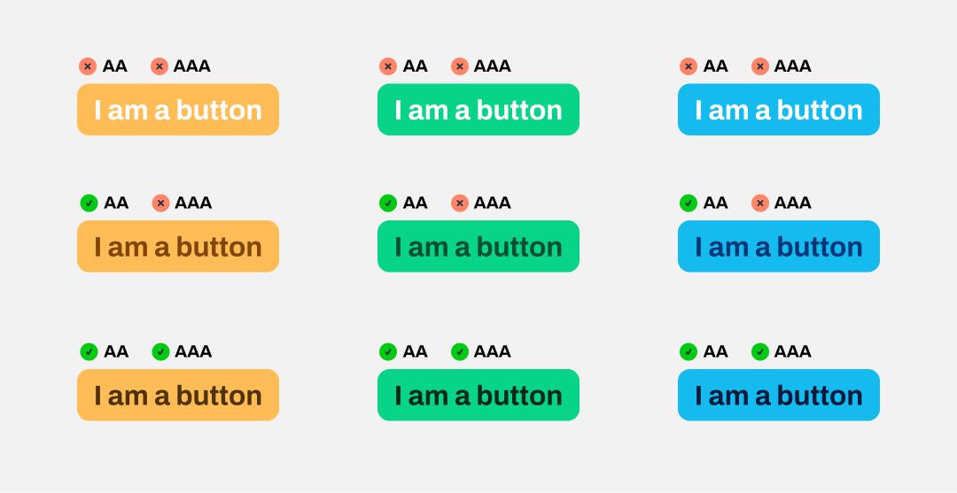
Example on how popular colour combinations can pass AA and AAA contrast ratio without changing the background colour.
Today there are numerous tools online to help you check your colour contrast ratios. Here are some of my favourites:
- Colour contrast checker
Allows you to play around with colour values and displays the changes live. Its biggest strength is that the page automatically changes the colour of the text if it no longer meets the minimum AA requirements. - Tangaru contrast finder
If your colour combinations are not accessible, but you still want to keep something somehow similar to what you had at the beginning, it finds the nearest accessible colour to your colour combination. - GitHub’s Primer Prism
The best tool for Colour Nerds. This tool unlocks accessible palettes in advanced mode: you will be able to create different values (light to dark) of a single colour, and the app will allow you to change the luminosity to make sure that the amount of light on each colour swatch stands as a whole with their neighbours. It also has accessibility contrast for each colour variation.
4: Adapt the UI to the play support
One of the strengths of GDevelop is that most of their interaction events (click, drag and so on) are automatically “translated” to the support in which the player is.
For example: if your game requires a click to interact with a button on Desktop, GDevelop will automatically make it a touch on Tablet. This is great for prototyping, but it does not exempt the creator from adapting the game to their final play support.
A common mistake is leaving desktop UI distribution and sizes (let’s say a 35px button on desktop) unchanged for the mobile version (which requires buttons around 45 / 50 px minimum). Accessibility research has found small target sizes on mobile are hard to interact with, mostly because of thumb size.
When choosing the final play support, think about how you can take advantage of the different inputs that they provide to improve usability: desktop has hovering status and more screen space, while mobile has less space, but finger gestures (double tap, drag, scroll).
Here’s some advice on how to design for mobile supports:
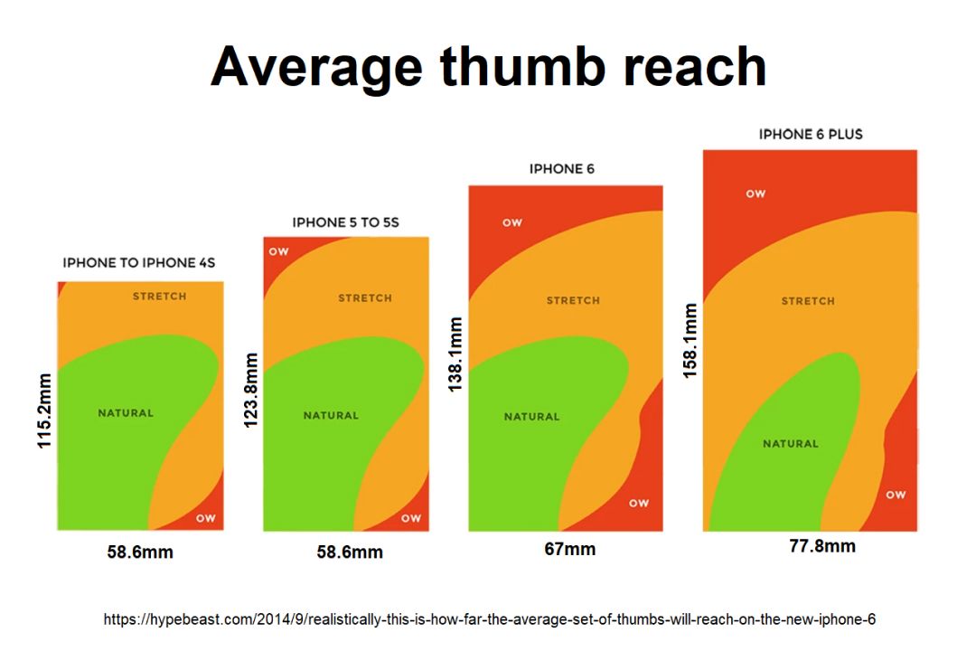
- Consider thumb reach on mobile
Depending on how the user is holding their phone, they might experience some anatomical limitations. Consider this schema to think about the available space for clickable targets.

- Make appropriate target sizes for mobile
Mobile vs desktop size difference doesn’t apply to button size only. It also requires an adapted space between the elements so users do not press one component instead of another. Use this target size cheat sheet by Steven Hoober to think and design your clickable elements according to their place on screen

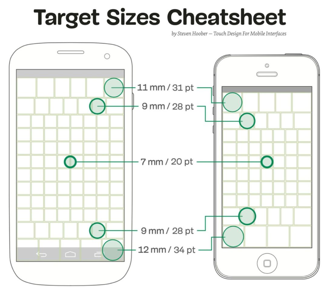
Sizes are in mm because pixel size tends to vary with time depending on new technologies.
5: Display UI only when needed
One of the most important roles of UI is helping the user finish their desired task efficiently. The developer has to think about how to reduce the user’s cognitive load.
A “quick way” -not so quick because it requires good thinking- to achieve this is by hiding the buttons or controllers that the user doesn’t need to execute a task.
On an English Learning app developed by Paulo Cavalcanti, we can see that they made the choice of hiding some parts of the UI while the player isn’t using them (1): The player moves around the space, but whenever they reach an element with which they can interact, new UI components display on the screen (2).

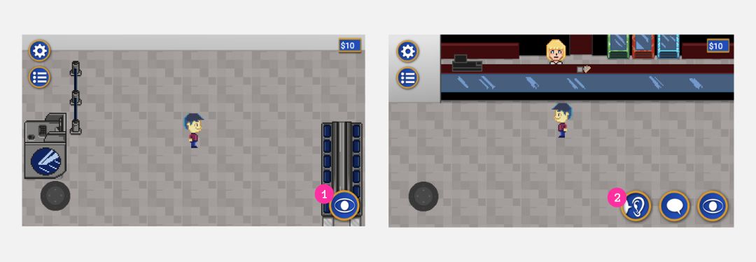
This is a nice way to unclog the space of the game, but still make the interaction discoverable so the player can interact with the available options.
When designing your game’s UI and HUD, think about the elements that the player needs for a certain mechanic: If your game has a territory-based / scouting dynamic it’ll probably require a map always visible on the screen. However, if the player only needs a map to navigate the game from town A to town B, consider displaying it behind a UI menu.
Working on the human-machine interactions of your game will greatly improve its adoption by the players.
Use this article as a guide to improve the main considerations when designing your UI components and menus. Feel free to also apply this advice to your game’s HUD design and implementation and keep testing with your targeted players.
There is nothing better than live testing the prototypes and demos with your target audience, but if you also want to gather general player feedback, use GDevelop’s player feedback feature to keep that good work going!
Ready to go further?