Bring Players To Your Game: How to Design Thumbnails That Actually Work

Evaluz Luna
Posted
Your game might be fun, or clever. It might even be beautiful. But if your thumbnail design doesn’t catch a player’s eye to click on it and start playing they'll never find out.
In a grid of dozens (maybe even hundreds) of games, your thumbnail design is the only thing standing between your game and a scroll past. And yet, many creators upload their game with a screenshot, some rough text, or an unfinished image that does little to sell what they’ve built.
The good news?
You don’t need to be a professional designer to create a thumbnail that works, as long as you understand what makes a great thumbnail.
Let’s break it down.
Why game thumbnails are important
Your thumbnail is your game’s first impression since it will be displayed in gaming sites where your game will be competing against others.
Most players will decide whether to click based on what they see in the first 2–3 seconds. A strong thumbnail design is the first (and often only) chance you get to win attention.
Usually, platforms don’t promote low-engagement content, so if your thumbnail doesn’t invite a click, your game has higher chances of being buried.
Common mistakes (that you can easily fix)
We spent some time on gaming site homepages to spot the most common visual design mistakes. Here’s what we noticed:
- Cropped screenshots showing only menu UIs or gameplay screens, which causes...
- Extra visual elements with text that’s too small to read or blends into the background
- Low-contrast images where nothing stands out
- Characters too small to recognize
- No element that is the central focus of the thumbnail, so it seems visually "noisy".
You need to ask yourself if a player can tell what your game is about at a glance. If the answer is “not really,” then you'll need to fix the thumbnail design.
A good trick to evaluate if your thumbnail passes the simple quality test is to put it at its real size (that means, the real size in which it will be displayed), and squint.


If you can still:
- Recognize the focal element of the thumbnail, and
- Have the least amount of visual clutter (being able to tell where shapes start and end)
Congratulations! You've done 80% of the work.
But if your thumbnails look like this:

Instead of this
You might have some work to do.
Can't tell why the second examples are better? Keep reading.
Design for the "5 second" rule
Your thumbnail has one job: get the player's attention.
To see if the thumbnail's design is doing its job, ask random people to look at the thumbnail for 5 seconds and note how they respond to the following questions:
- Can they describe what the game is about?
- Can they tell how are they meant to play the game? For example, the person may answer: I think I would play as the farmer that I see in the thumbnail
- What kind of emotion will be experienced by playing the game (stress/high stakes, relaxation, excitement...)?
- Is there anything memorable about it? (a color, a shape, a character...)
These answers will help you understand how your thumbnail will be perceived among other competitors.
Simple Design Principles (advice from a Designer)
Here are five easy rules that instantly improve almost any thumbnail:
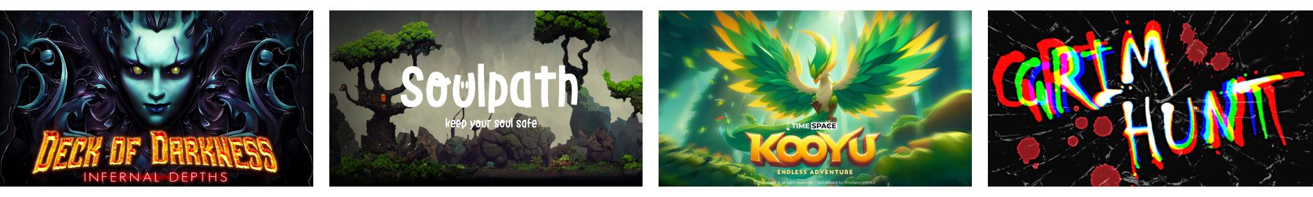
1. Focus on One Main Thing
Make a main character, object, or game name the centrepiece of your composition. This is called a "focal point". Deck of Darkness, Soulpath, Kooyu, and Grimhunt make the name of the game the main focus of their thumbnails. They use the rest of the elements as visual support without stealing attention from the name.

2. Use Contrast
Bright characters on dark backgrounds -or vice versa- grab attention. Complementary colors of the color wheel too. Use color contrast, effects or shadows to separate your subject from the background. If you're new to color theory consider doing the 4th chapter of our UI/UX Essentials course in the app.
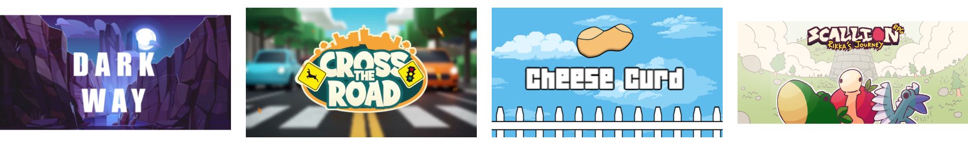
Darkway goes for a dark background light text contrast. Cross the road uses a background blur and outlines the foreground to improve contrast. Cheese curd uses complementary colors (blue against yellow/orange) and simple outlines to separate the rest of the elements. Scallion uses one of my preferred techniques: color saturation (unsaturated background and bright foreground) and brightness to reduce the visual noise.
3. Ditch the HUD
Don’t use raw gameplay screenshots with menus, scores, or joysticks. It looks unpolished and unfinished.
4. Make Text Large or Leave It Out
If you use text, keep it short and bold. Only include text that will help the player make their choice. Leave out irrelevant information that will only clog the image.
5. Make It Recognizable
Characters with faces, strong silhouettes, and distinct colors stick in people’s minds. Display the elements that best represent the universe of your game.
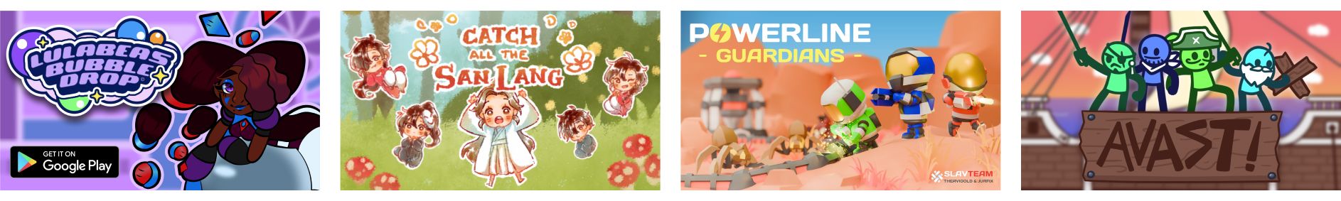
Lulabea's Buble, Catch all the Sang Lang, Powerline Guardians, Avast displaying their particular character design in the thumbnail.
6. Adapt your composition to the thumbnail
Compose your art to fit the horizontal or square size of your thumbnail. Spend some time in the site where you're planning to publish to study the competition to plan ways in which you can stand out.
Online tools
Professional Designers have their own preferred tools. Maybe you have yours already, but if that is not the case here are some available tools to help you create high-quality thumbnails in minutes:
- Canva: They have ready-made templates tho they do not have "video game thumbanils" yet. Their drag-and-drop design tools are easy to learn and give enough flexibility without the technical hyper-specialised designer tool functions.
- Remove.bg: Instantly removes background from character sprites or screenshots. Useful if you want to get a specific angle of a 3D character and do not want to deal with masking and vector tools.
- Photopea: If you're familiar with Photoshop, you will quickly learn how to use it. It is browser based and free.
- Penpot: An alternative to Illustrator and Figma. It is a vector based tool so you might get les flexibility if you're dealing with jps images only, but vectors are great when you need to produce art that requires scaling without getting distorted.
- Coolors : Get color palettes that don’t clash (great for backgrounds and UI) and that ensure a good contrast to make elements stand out.
- AI image generators: Able to produce good-enough logos and illustrations based on creator prompts. One downside is that it might produce art that does not look like your game assets which would give false expectations to players. What you can do is to use the AI to design the color an composition of your thumbnail and you can replicate it by hand with your own game art.
You don’t have to reinvent the wheel
In this example, Antarctica uses an opposing color palette of blues and reds to create visual contrast.
The thumbnail also has 2 main focal points: the name of the game (1) and the main character (2). They also use the hands of the enemies getting closer to the character which creates straight lines that guide the eyes to the center of the image.

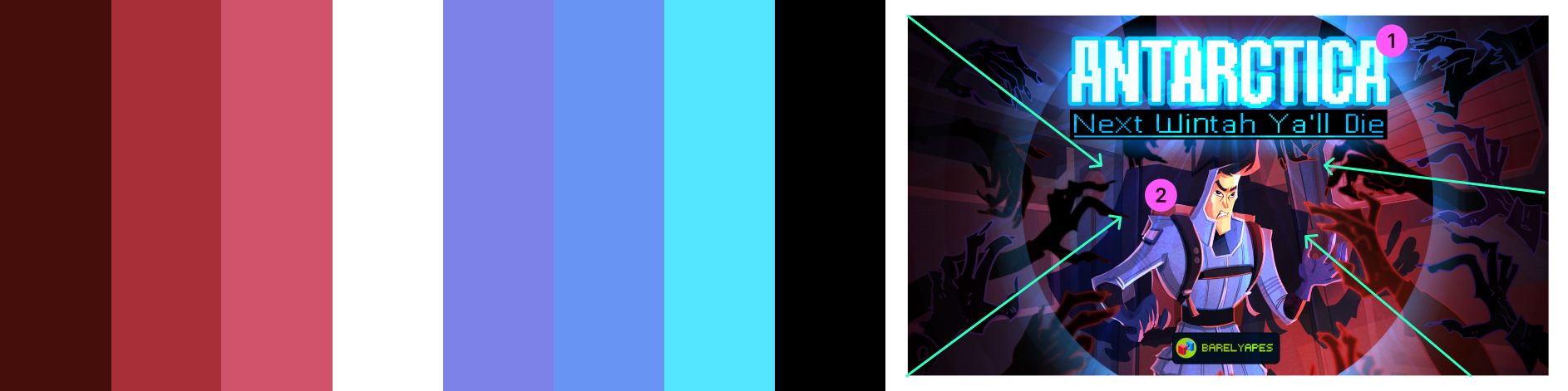
They also reenforce the visual focus by adding a circular shape that frames the name and the character.
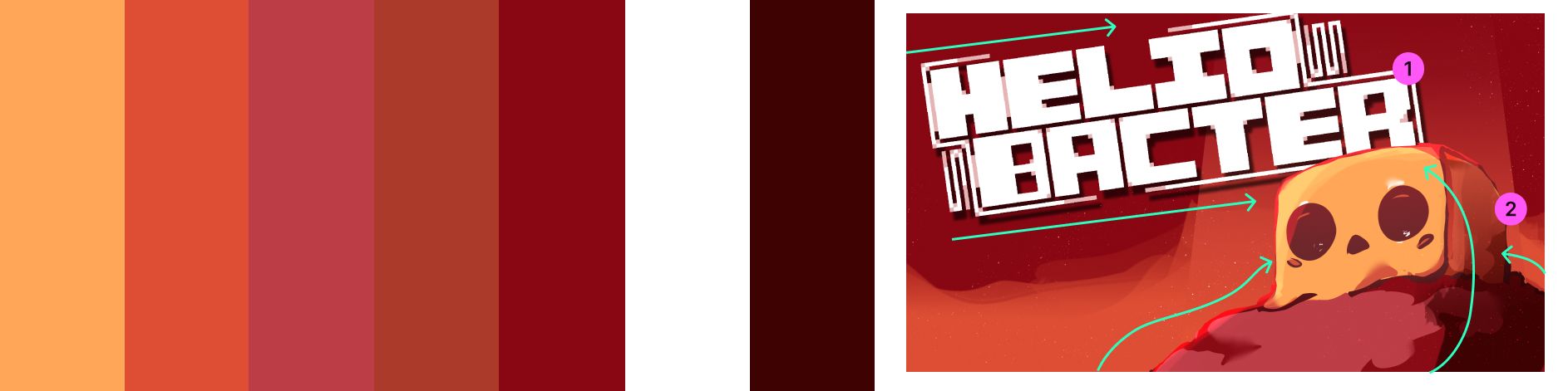
Heliobacter has a different approach for composition: they are using an harmonious color palette (reds/oranges) and element position to guide the eye of the reader upwards. This thumbnail is a great example of how "less is more".
Don’t overthink it. Many popular games reuse the same basic thumbnail structure:
- Character + glow + logo
- A dramatic action moment
- A face close-up + colored background
Use layout inspiration from top games you see on gaming platforms. Study what works, and mimic the composition.
If your game is cute, lean into that with bright colors and big eyes. If it’s dark or mysterious, go bold with silhouettes and shadows.
Don’t let a bad thumbnail hide a good game.
You’ve put time into your game. Make sure people actually try it. You don’t need to be a designer. Start by these simple rules and keep practicing. :)