Borrowing Without Copying: How Indie Devs Can Read and Improve Game UI

Evaluz Luna
Posted
When you’re playing games online or browsing beautiful UI screens, it’s easy to feel inspired by the visuals while hesitating about how to bring something so well executed into your own project.
The amount of screens you need to design can feel overwhelming. You might catch yourself thinking "how in the world do I fit all of this into one UI?"
It’s fine. We’ve all been there, and it still happens to me as a professional interface designer.
In this article, I’ll walk you through a simple methodology to help you study video game UI screens. You’ll learn how to analyze them, how to understand the intention behind each layout, and how to decide which information deserves the spotlight in your own game.
Finding inspiration for UI design
We all have apps or games we love. A good starting point is simply asking why the interface of your favorite interactive experience feels so joyful or effortless.
If nothing comes to mind, here are a few places to explore for reference UI images.
- For apps made in GDevelop:
Mobbin lets you search by app and by user flow. For example, you can look up what a learner sees after finishing a lesson. It’s a great resource if you want to study how apps show information step by step, how they let users go back, save changes, or avoid accidental exits.
You can also follow design studios like Ustwo, which often share creative interface ideas and thoughtful design patterns. - For games made in GDevelop:
Interface In Game specializes in video game screens. You can filter by genre, theme, or platform. They sometimes mix visual aesthetics with genres, so filters might feel a little unusual, and the site can be slow on some computers.
Another option I personally prefer is Game UI Database, with clearer filters and quicker loading.
Start by analyzing the interaction structure, not the style
When we first interact with a game interface, the visual charm is usually what catches us. But functional UI carries the deeper purpose. It guides navigation, supports the game systems, frames the story, and helps players make decisions.
So when you look at a screen, ask yourself a simple question:
"What is this screen trying to organize?"
It might be:
• system configuration such as controls or volume
• storytelling moments like lore pages or cutscenes
• first-time experiences and onboarding
• character interactions and dialogue choices
• marketplace or inventory decisions
• urgent HUD information like health, stamina, or ammo
Once you focus on the intention behind a screen, the surface decoration feels less intimidating. You may even uncover clever solutions you can adapt for your own project.
All interfaces must optimize for three things:
• Clear system comprehension: what to do, how, and when.
• Quick decision making: players should not feel overwhelmed.
• Protection against fatal errors: the right feedback at the right moment.

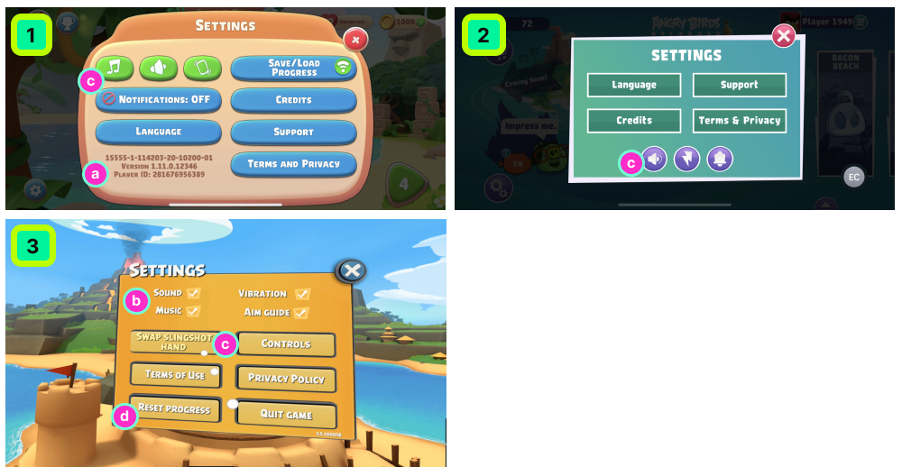
In this example we see the same Settings screen across three different games.
Although they all belong to the Angry Birds franchise, their design differences are easy to spot.
Design Analysis:
- The first design displays the game version and player ID while the other two do not (a). Only the team behind the game knows why that information needed to be here.
- In design 3, sound, music, vibration, and "aim guide" settings are easy to read and understand at a glance (a). Designs 1 and 2 make the on and off states harder to understand (c). You wonder if tapping a button will toggle a setting or take you to a different screen.
- Designs 1 and 3 mix predictable and unpredictable button behaviors. Some lead to new screens like controls or credits. Others trigger potentially destructive actions like resetting progress (d). And a few do something else entirely, like changing slingshot hand position (e) without telling you what the current state is.
It’s hard to know all the constraints and goals a team must balance. But staying critical and curious helps you become a more intentional game developer.
Observe how the designer handles information
Grouped elements tell a quiet story. Items that sit close together almost always share meaning. You can learn more about this in chapter 4 of the UI/UX Essentials course.
Screens that hold a lot of information are usually the hardest to design. They require a calm and confident hierarchy.
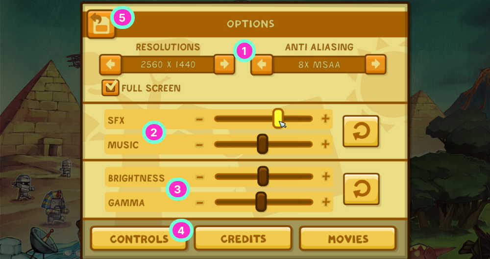
Take this screen from Scribblenauts Unlimited.
It’s a strong example of a dense Settings menu that still feels approachable.
Design Analysis:
- "Resolution" and "anti-aliasing" values (1) use components that make it clear you can increase or decrease the value. Even if you don’t know what “8X MSAA” means, you understand the action behind the arrows.
- Sound settings stand close together (2). Light settings do the same (3).
- Controls personalization is not on the first level of the screen (4). My guess is that once you configure your controls, you won’t revisit that section as often. Meanwhile, sound and brightness might need quick adjustments, especially if you’re playing in a loud or bright environment.
- I love the “save and go back” button in the upper left (5). A good way to signal the user that they'll be saving changed configurations is by displaying a "back" button unless the game detects a change. In that case, it turns into “save and exit”. A small, thoughtful detail.
Look for patterns that repeat
Patterns help players navigate and learn. Primary actions should have recognizable visual cues. Buttons should stay in predictable positions and behave consistently. Looking at a game’s primary actions reveals what the game considers important.

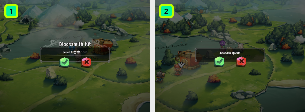
For example, this screen from Cat Quest II.
It shows the “Abandon Quest?” dialog. The yes button is green and the no button is red.
Design Analysis:
- Accept and cancel dialogs usually follow a familiar pattern. One button accepts, one cancels. Most games rely on this rhythm.
- In the first design, the red cross creates confusion. Does it close the message or reject the item. Replacing the cross with a neutral icon or adding clear labels like “accept” or “close” would help.
- Quitting screens are sensitive. Players often rely on muscle memory, so pressing green without reading can lead to regret.
- In a design for a screen that deletes sessions or important information, the game could flip the colors: the affirming action could be red and the cancel action green. This small shift will slow down the user's muscle memory, and prevent accidental losses.
Separate what you admire from what you actually need
Some screenshots attract you because they are beautiful. Others stand out because they solve an interaction problem elegantly.
Good UI combines both. It makes choices clear, actions easy to execute, and progress safe, all while staying aligned with the game’s art direction.
When you study references, spend time with the support layer first. It’s where the real learning lives.
Here is a quick recap for your UI study journey.
- Building a moodboard you can actually use.
Collecting pretty UI images is easy. Using them to guide your design requires thoughtful analysis.
A good moodboard does more than curate aesthetics. It reveals strengths, limitations, and opportunities in the examples you gather. - Gather images with purpose.
Choose images for specific reasons. Maybe one highlights selected items in a clever way. Another sets the atmosphere you want players to feel when they open your menu. Add notes about what caught your eye. - Sort by function, not by game.
Place menus with menus, HUDs with HUDs, inventories with inventories.
This reveals patterns more clearly and helps you avoid leaning too heavily on a single game. UI functionality tells the truth about intention. Game genre often distracts with mood. - Annotate your reactions.
When something stands out, write down why. Maybe the spacing feels safe. Maybe the icons feel modern and friendly. These notes help you understand your taste and guide your decisions later. - Look for emotional throughlines.
A moodboard works best when it has direction. Maybe everything feels soft. Maybe everything feels mechanical. Maybe the mix has a quiet logic behind it. Step back and ask, what emotion does this board carry. That emotion often becomes the seed of your UI identity. - Translate observations into decisions.
Once the board feels coherent, try shaping a few early rules:
I want wide spacing.
I want a single accent color.
I want rounded typography.
Be careful about getting distracted by new UI styles
If your moodboard feels directionless, look closer at your references. They should help you set guidelines for:
- Typefaces such as serif, sans serif, or monospace
- Color choices including primary and complementary sets
- Scale such as main sections versus actions
- Hierarchy such as what requires immediate attention
Once these seeds are set, avoid adding new typefaces, colors, or scale rules. Exceptions and inconsistency weaken interfaces.
Tip: If you want to go deeper into these topics, explore our courses “ UI/UX Essentials” for color, typography, and human psychology, and “ Mastering Game Typography” for choosing the right typefaces for different languages, aesthetics, and screen sizes.