How to Create a Memorable Game Logo

Evaluz Luna
Posted
When you're putting the final touches on your game, creating a thumbnail could feel like just another task on your to-do list. But your game's logo design is much more than just text! It's often the first thing players notice about your creation.
I've seen many developers pour their heart into gameplay, art, and mechanics only to rush through the logo and thumbnail design.
In this article we'll cut through all the typography choices available so you can choose your logo with purpose, and make your game stand out in a sea of thumbnails.
Choose display or decorative fonts for impact
Think about the last time you scrolled through games on your phone or computer. Which logos caught your eye? Chances are they weren't using standard fonts like Times New Roman or Arial.
Display and Decorative fonts are your friends here. These fonts are specifically crafted for headlines and attention-grabbing text. They have personality and flair that "body text" fonts intentionally avoid.
For example, if you're making a puzzle game called "Bubble Pop," a rounded, bouncy font immediately feels more appropriate than a serious, formal one. Thinking about the message or the "vibe" of your game will help you select the font, and choosing the proper font will help tell your game's story so players get interested in your pitch.
When browsing font options, ask yourself: "Does this font feel like my game?", "Is it memorable?". If you've made a spooky adventure, a playful comic-style font might send mixed signals to potential players and it might be harder for them to predict what to expect from the game.
If you're new to typography, the first thing that you need to know is that the shapes within your letters speak a visual language that players intuitively understand, even if they don't realize it.
To give you a head-start on typography, here are some examples on how you can unlock the power of letter traits to build your storytelling for your game logo design:
Weight and trait width
Thickness (fat, thin, slim...) and spacing are real-life qualities that when applied to typography, can communicate a sensation. Just as in the real world, this will help your players understand what is "the vibe" they can expect from your game based on your game logo:
- Heavy letters:
Officially called "Bold", these traits command attention and suggest substance, reliability, solidity... but also inflexibility or monolithic tradition. They work well when you want to project confidence, importance or heavy and solid concepts. - Thin letters:
Also called "Light" or "Thin". These letters can feel more sophisticated or delicate... but also fragile. They're great for games with elegant themes. - Narrow and close together:
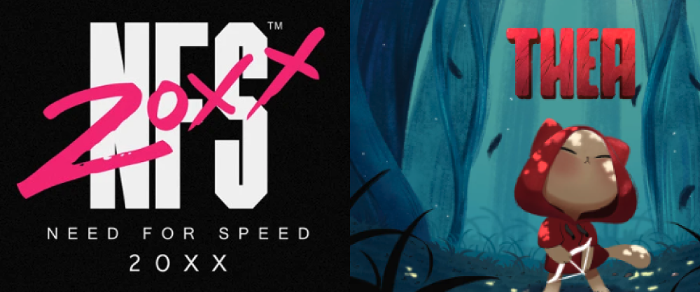
"Condensed" styles create a sense of pressure, constraint, or high social status. They could be used for various cases like disrupting dystopias or high fashion storytelling. "Need For Speed 20XX" logo by Bao T. Nguyen, or "Thea" by Giulia di Cara use Condensed styles.

- Wide letters:
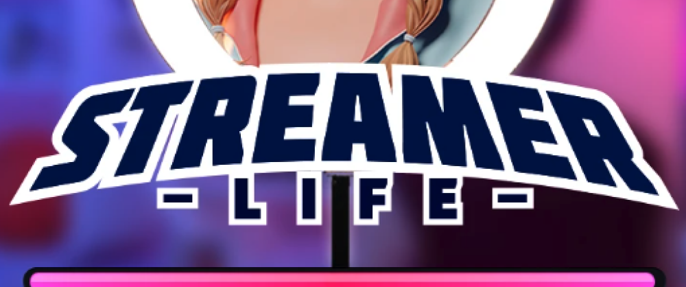
"Expanded" letters have wide traits. They're like if a letter was wearing oversized clothes. Its design has similar "vibes" as Bold (stable, reliable) but might have more of a "relaxed" feeling to it. They communicate stability and trustworthiness. "Streamer Life" from Kashmine Irfan adds an expanded treatment to the logo to give it a "college logo" vibe, which can communicate a message of "young and relaxed".
Design "vibes" in typography
Besides weight an width, Type Designers enrich the design of their letters with other visual traits to further push the identity of a memorable game logo design to its alphabet.
Besides technical constraints (like "Monospace" for example), Designers have a choice of multiple shapes to choose from to give a "personality" to a letter. Their process is long because it requires creativity, craft and technical knowledge.
Just for context on why designing the "vibe" of a text could take so long, this Vox video quickly explains how monospace pixel-based typefaces were born, as well as the challenges for readability.
As you can see, different font traits and styles carry cultural and emotional associations that can help to become memorable and communicate your game's essence.
Going through Design School and doing a Masters in Typeface Design is a long journey. So here is a simple list to help you understand some of those available traits.
- Fancy (Serifs):
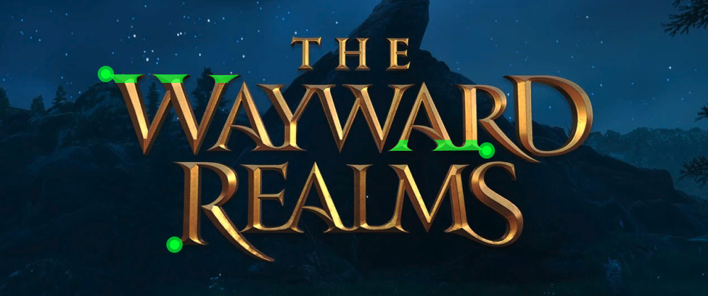
These fonts have little extra strokes or "feet" at the ends of letters. They often remind us of old books, newspapers, or formal invitations. If your game has historical elements or a touch of class, serif fonts can reinforce that feeling. "The Wayward Realms" by Ian Phoenix is a good example of elegant, serif-based (identified in bright green) logos.
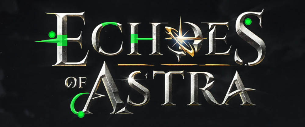
- Magical (compensated strokes): These fonts have varying line thicknesses and often feature flourishes or swashes. They evoke storybooks and enchanted worlds. "Echoes of Astra" logo by Pixarts Studio is a great example of traits that go from thick to thin to thick again, as well as some curved elements at the end of the characters.
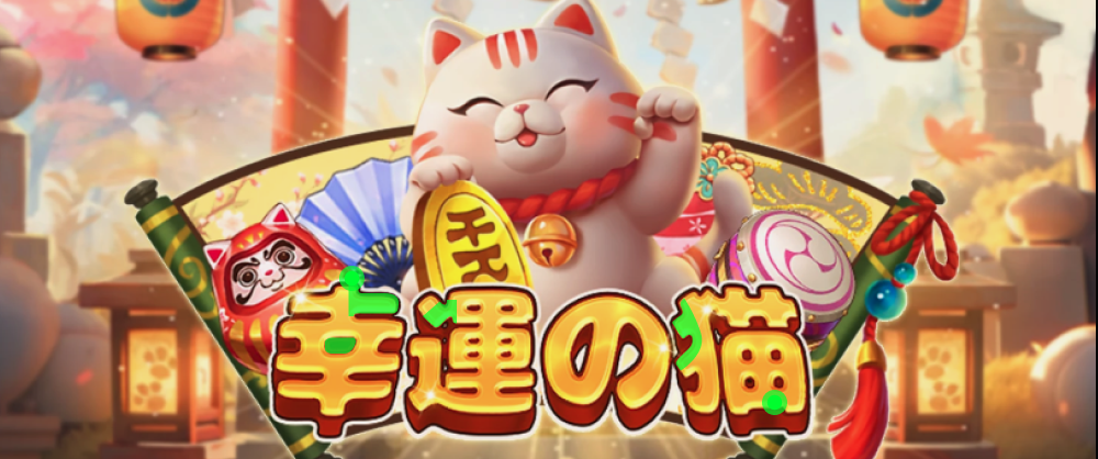
- Friendly (rounded or irregular strokes): Fonts with irregular "cut out paper" look or soft edges feel approachable and welcoming. They're perfect for games that should feel enjoyable for everyone. Many wholesome games use these fonts to signal that they're stress-free experiences. Lucky Cat by Jin Yang adds rounded traits to the traditionally pointy Kanji letters. This choice softens the message and makes the game look friendlier.
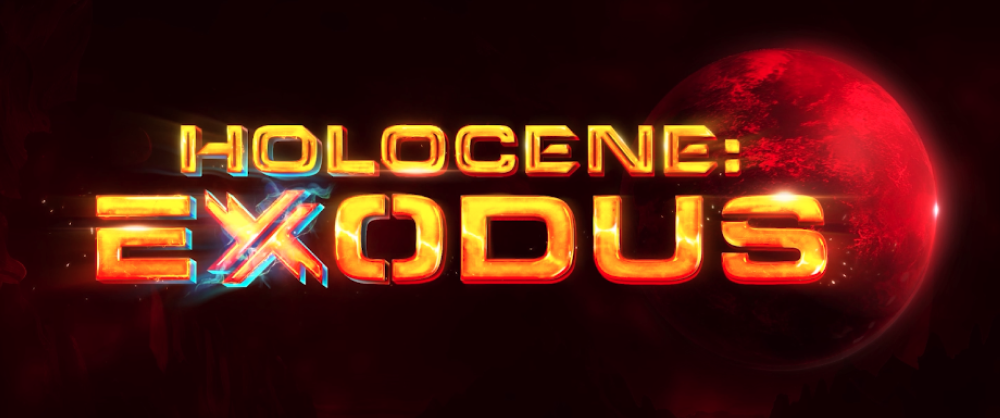
- Techy (angular, geometric): Clean lines and precise angles suggest technology, science, and innovation. If your game involves robots, future tech, or programming elements, these traits could help establish that context immediately. "Holocene Exodus" logo by Pixarts Studio uses squared traits to tell the Sci-Fi story through their logo.
- Pointy letters:
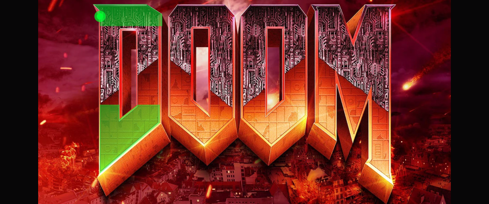
Their "pointy" traits naturally create tension. The human brain associate sharp edges with potential danger (for example thorns or knives). These traits could works for action games, competitive titles, or anything with conflict at its core. Doom's historical logo by Don Ivan Punchatz is a gold standard example of this characteristic.
Adding visual effects to typography
Standard typefaces work for reading text, but game logos often benefit from some extra visual "bejush" (the word I use for "flair") to fully embody the personality of a game. Here is a short list of material finishes that you can use for a game logo design:
- Light effects:
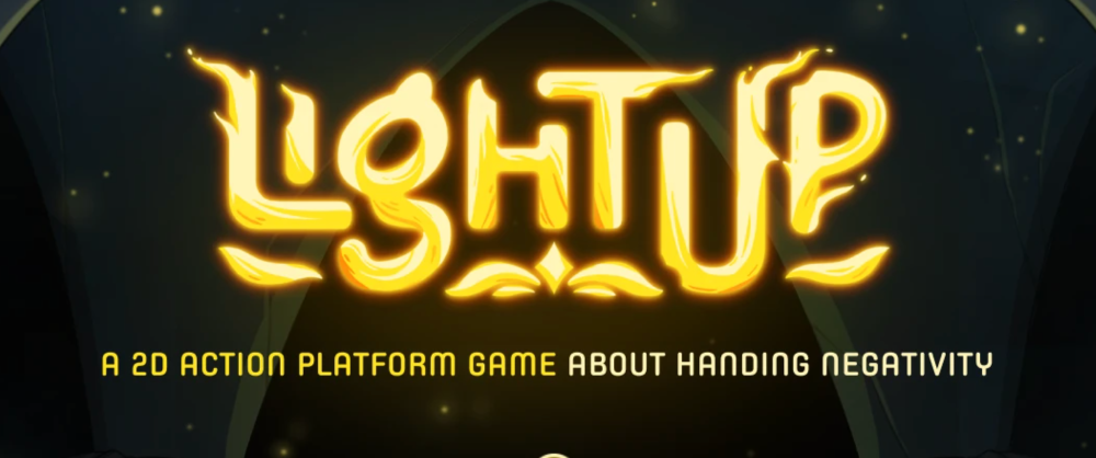
Adding glow, sparkle, or illumination can make your logo communicate your game's lore or high-tech universe. Light effects work particularly well for games involving magic, technology, or celestial elements. Just be careful not to overdo it so the text remains readable. Lightup by Tien Bui and Tori Trịnh gracefully makes liquid light the logo of their game.
- Liquid:
Dripping, flowing, or bubble-like effects suggest transformation or organic elements. These can be perfect for games involving water, slime, or biological themes. - Fire:
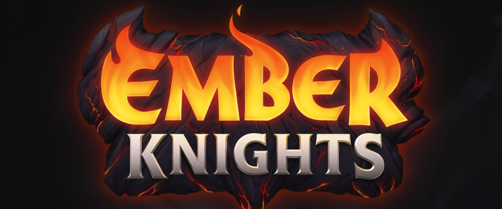
Flame effects immediately communicate energy and intensity. They're natural fits for action games, competitive titles, or anything with "hot" gameplay. Ember knights by Cold Castle Studios uses lava as the material for half of the logo, and reinforces the message with a "charcoal" background.
- Metal:
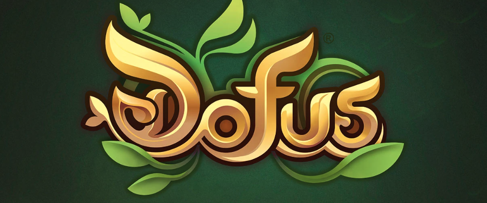
Metallic textures suggest durability, value, or industrial themes. They work well for games involving crafting, machinery, or warfare. Franho Houssin used a golden color for their logo "Dofus" and even when the design doesn't go as far as rendering it fully as "gold", the message goes is understood thanks to the color choice.
- Ice or Frost:
Frozen or crystalline effects communicate coldness or preservation. They're ideal for winter settings, ice magic, or games with a chilly atmosphere. - Stone or rock:
Rocky textures suggest permanence, strength, or ancient origins. They're perfect for games with historical settings, earth magic, or monumental themes. Cold Castle Studios' Ember Knights logo looks like carved stone which sends the message of "powerful, reliable" but the visible cracks also say "however, the superheroes can still be hit...and keep fighting!!"
Material representation could be challenging if you're not an Illustrator, but you can always learn by observation. The past examples have a mix of color gradients and simulated textures on top, so take it layer by layer.
If your game is small and made to play for free a quick AI prompt for image-generation could do, but if you're planning on going professional consider hiring a professional Designer since -in my experience- LLMs aren't great with visual recognition and tweaking can be long and annoying.
Playing with perspective
Adding dimension to the logo would help it stand out if you're placing it against a busy background. Just as material, spacial references could add depth and substance to your message to better communicate the universe of your game.
- Shadow and depth: Even simple shadows can add visual interest and help your logo stand out against backgrounds. They're a subtle way to add dimension without committing to full 3D.
- 3D effects:
Making your letters pop off the screen can create a sense of physicality. You've already seen this treatment in games where building blocks are central to gameplay, or contemporary commercial games. - Isometric perspective:
This technical, slightly tilted view creates a game-like feel that's particularly suited to strategy or building games. - Vanishing point perspective:
Letters that appear to recede into the distance suggest movement or a journey. They're popular for racing games or adventures with a sense of progression or speed.
Technical considerations for logo export
There are two formats to create a logo: vector based, or image based.
Professional Designers are big fans of vector-based graphics. However, when you're dealing with materials, vector-based logos could get heavy.
So, if you're going for a simple-color-little-texture logo like "Mario Kart", "Legend of Zelda", or "Stray" chose ".svg" vector files.
Other vector-based files could be ".ai" for Adobe Illustrator or ".eps" for high compatibility across devices.
I personally prefer to save in ".svg". Vector graphics can scale infinitely without losing quality, which is invaluable when you want to keep a small file size without biting your nails if it needs to be scaled for -let's hope one day- a huge Game Convention banner size.
If you're going for a material and light effect heavy logo (like the examples in the "visual effects" section) go for a ".png" file with transparency.
You will never know if a Marketer will request your game's logo for printing one day, so it is better to start big and scale down. NEVER (never never EVER!) the other way around.
I recommend creating your logo in a transparent background of at least 1500px wide at 350dpi, so you have plenty of resolution to cover business cards, magazine ads or even event banners.
Printing supports require different resolutions from an ok-ish 75 to 350dpis depending on the material and size on which they'll be printed. Going big from the beginning will prevent your logo displaying poorly.
Inspiration and resources
There are plenty of sites where professionals have their portfolios. Gaming's visual language is somehow standardised to highly rendered and crowed compositions. Going to other domains like Motion Graphics, Editorial or Packaging Design could give you a fresh look and expand your available references for inspiration.
Sometimes taking an approach of "standing out from what looks the same" could wittingly give you a competitive advantage.
Here's a list of professional Design environments to find typography and logo design inspiration:
- Font libraries:
Sites like DaFont, Font Squirrel, have a variation of free and premium fonts. Browse the "Display" or "Decorative" categories for game-appropriate options. - Game logo inspiration:
Spend some time on Behance, Dribbble or Logo Pond searching for "game logo" to see what professional designers are creating. You can also simply browse game stores and notice which logos catch your eye. - Typography tutorials:
YouTube has countless tutorials specifically for game logo design. Watching someone's process can help you understand the thinking behind effective typography. - Reference existing games:
Look at successful games in your genre. What typography patterns do you notice? You don't want to copy them directly, but understanding genre conventions can be helpful.
I've found that designers that I admire help me stay inspired when I'm feeling stuck. Sometimes just seeing how others have solved similar problems can spark new ideas.
Pro tip: When using fonts, always check the license! Some fonts are free for commercial use, while others have a free sample for testing but require purchase for commercial uses.
Testing your typography
Before finalizing your game logo, put it through these simple tests:
- The thumbnail test:
Shrink your thumbnail down to the original size and squint. Can you still make out what it says or recognize the shape of your logo? Is the feeling still there? - The glance test:
Show your logo to someone for just 2-3 seconds, then ask them what they remember. This simulates how quickly players scan through game options. - The no-context test:
Show your logo to friends without any context and ask what kind of game they think it represents. Their answers will tell you if your typography is sending the right signals. - The competition test:
Take a screen capture of the catalog store or game category in which you're planning to publish. Place your thumbnail in the grid and observe if your thumbnail and logo design drag the attention from the viewer.
Typography might seem like a small detail when you're focused on perfecting your game mechanics, but it plays a huge role in how players perceive your creation.
Remember that there are no absolute rules, only guidelines. The most important thing is that your typography feels right for your specific game and helps it connect with the players you want to reach.